
.svg)
Lyfefuel - CRO Audit
CRO audit of a nutrition & supplements eCommerce brand — pinpointing why the homepage wasn’t converting and the redesign that fixes it.
Year
2025
Services
CRO Audit
Industry
Healthcare
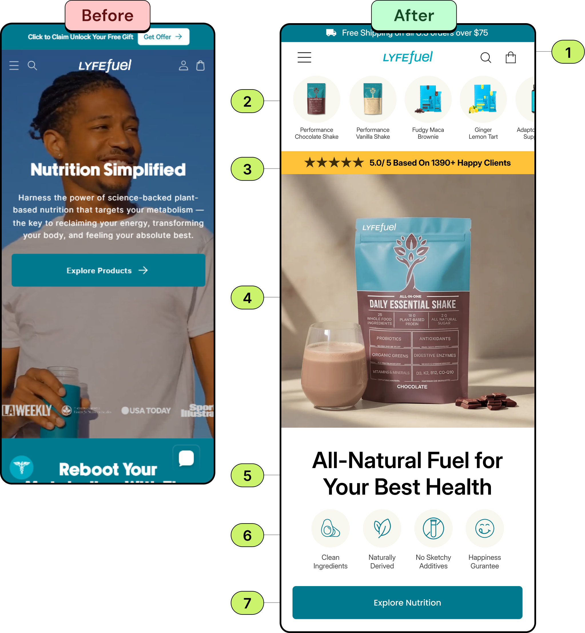
- Simplify navigation with a clean header. Use a minimal top bar with a hamburger menu, search, and cart icon to reduce clutter and keep the focus on the core message.
- Introduce quick-access product thumbnails below the header to help users explore categories instantly. This improves discoverability and supports faster browsing for visitors.
- Add a prominent review badge (e.g., “⭐ 5.0/5 Based on 1390+ Happy Clients”) near the top of the hero section to build trust and reassure new users about product quality.
- Feature a high-quality hero image showing the product with contextual props (like a shake glass) to evoke lifestyle and aspirational association, improving emotional engagement.
- Replace generic text (“Nutrition Simplified”) with a clear, outcome-based statement such as “All-Natural Fuel for Your Best Health.” This instantly communicates value and the product’s unique benefit.
- Use icons to quickly convey core attributes (e.g., “Clean Ingredients,” “Naturally Derived,” “No Sketchy Additives”). This visual clarity helps users scan benefits effortlessly and builds trust.
- Consolidate CTAs into one strong action like “Explore Nutrition” ensuring it’s full-width, high-contrast, and 56px in height for optimal mobile interaction. This provides a clear next step and minimizes decision friction.
Recommendation
The Audit: Why the Homepage Wasn’t Converting
The Challenge
1.
Cluttered navigation competed with the core message
2.
No quick-access product categories below the header
3.
No ratings or social proof to reassure new visitors
4.
The hero didn't show the product clearly or evoke a lifestyle
5.
The headline was generic and didn't communicate a clear benefit
6.
Key product attributes weren't scannable or icon-led
7.
A weak Multiple competing CTAs with no single clear next stepCTA with no clear next step
The Solution
We redesigned the homepage around conversion best practice — a clean, minimal header, quick-access product categories, a prominent review badge, a lifestyle-led product hero, an outcome-based headline, scannable feature icons, and a single high-contrast CTA. The result is a focused, mobile-first homepage built to convert.
Book A Free Call
Get a focused CRO audit and a clear, prioritized redesign plan for your store.

Focused Messaging
%201%20(1).svg)
Conversion-Focused Design

Industry-Tested UX
.svg)
.svg)
.svg)
.svg)
.svg)
.webp)
