

Nutradora - CRO Audit
CRO audit of a supplement eCommerce brand, reviewing the homepage, product page, and cart, and the redesigns that lift conversion.
Before → After: Home Page
We rebuilt Nutradora's homepage around the audit findings — a product-led hero, stronger proof, scannable benefits, and a high-contrast CTA. Here's the original beside the proposed redesign.
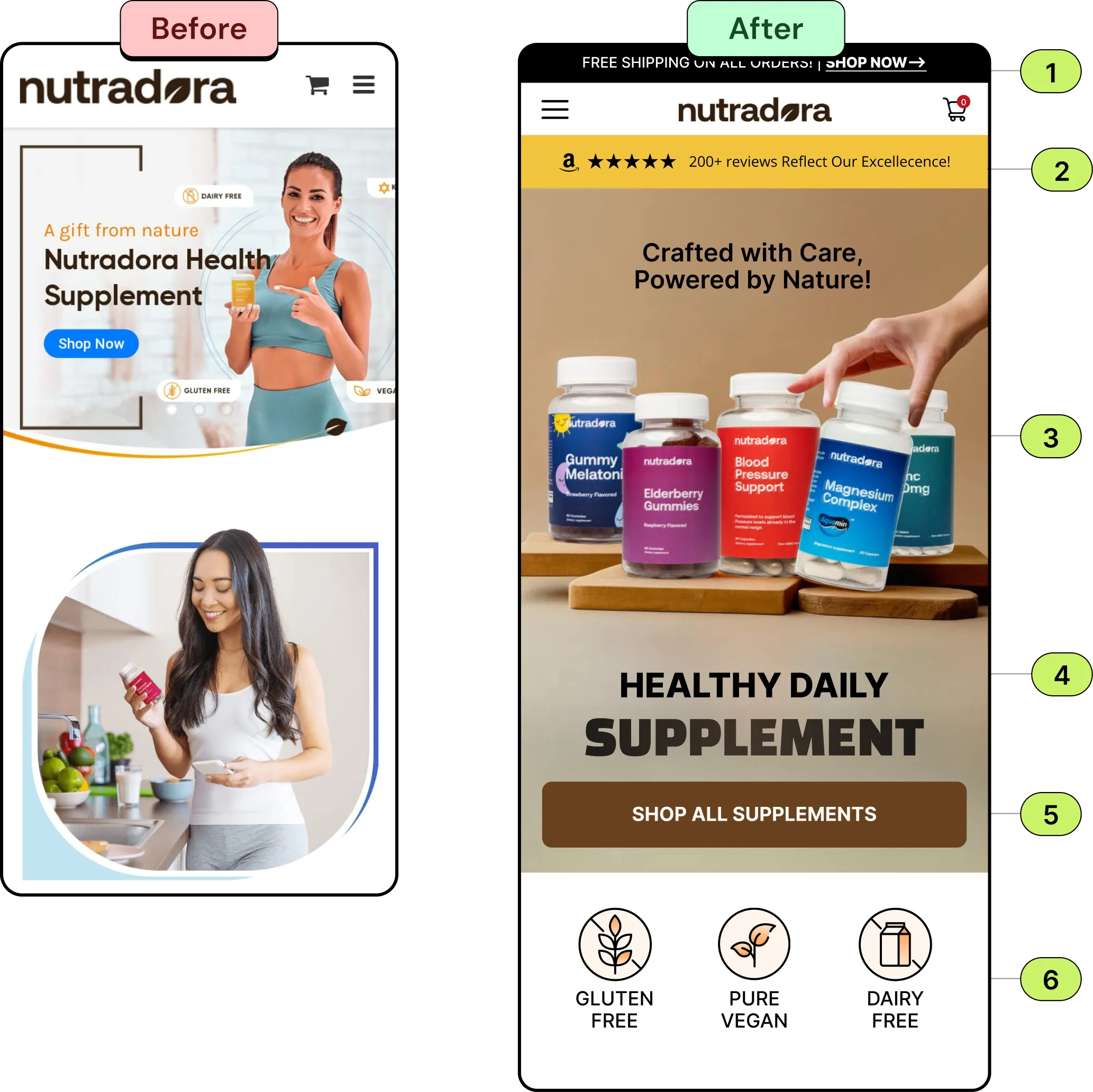
- Update the announcement bar and add an actionable link to push users further down the funnel, encouraging them to ‘Shop Now’.
- Add social proof to easily build trust and credibility, especially with new users.
- Showcase your products in the hero image to help users immediately understand what you sell at a glance.
- Instead of marketing heading Highlight your unique selling proposition directly in the heading, allowing users to see what makes your brand great the moment they land on your site. Ensure to use darker contrast on the texts to make the message more legible for users.
- Make sure your primary action button is full-width, has good a contrast ratio, is at least 56px in height, and placed on the lower half of the fold.
- Reformat the key traits for an easier readability, allowing users to better see the benefits they can take advantage of, thus helping break down purchase barrier more easily.
Before → After: Home Page
We rebuilt Nutradora's product page around the audit findings — clearer product info, richer imagery, scannable benefits, bundle offers, and a high-contrast CTA. Here's the original beside the proposed redesign.
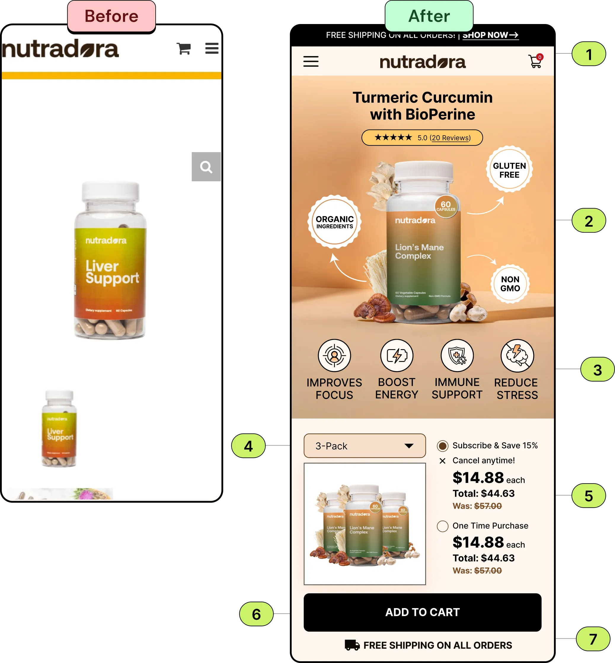
- Enhanced product page with clear product names and add review to the top to build trust from new users.
- Enhanced product imagery to provide clear views of ingredients, promoting transparency and facilitating informed purchasing decisions.
- Highlighted key product features prominently after the image, allowing users to better see the benefits they can take advantage of, so users know what makes your product different from competitors and why they should buy this.
- Implemented an intuitive offers dropdown, enabling users to select bundle options and view corresponding discounts effortlessly.
- Present users with a bundled offer and a one-time deal, allowing them to choose. Highlight the bundled option to emphasize savings and encourage subscriptions, guiding users towards a budget-friendly model.
- Add clear and full width ATC button, has good a contrast ratio, is at least 56px in height, and placed on the lower half of the fold.
- Layer your free shipping offer directly underneath as shipping costs are the #1 cause of cart abandonment.
Before → After: Home Page
We rebuilt Nutradora's cart around the audit findings — best-selling bundles, clearer product cards, and a reassuring free-shipping CTA that turns an empty cart into a sales tool. Here's the original beside the proposed redesign.
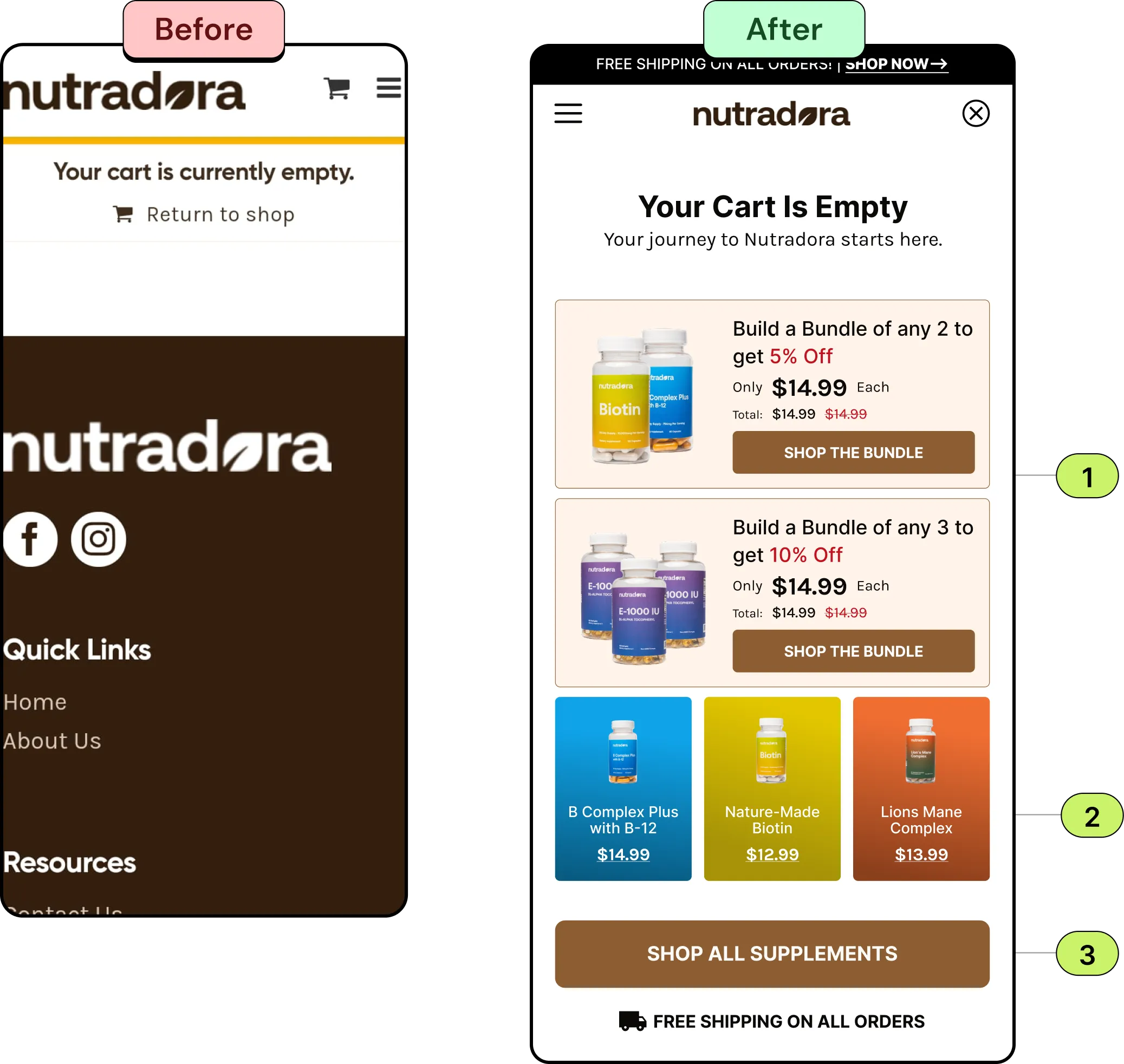
- Introduce best selling bundles with images, lables, product prices, and encourage users to take action.
- Show best selling products card layout, utilizing distinct colors for each product to improve visual appeal and ease of product identification.
- Concluded with a clear call-to-action, directing users to "Shop All Supplements," accompanied by a reassuring "Free Shipping On All Orders" message, thus helping break down purchase barrier more easily.
The Audit: Why the Homepage Wasn’t Converting
The Challenge
The Solution
We audited the full purchase funnel, homepage, product page, and cart — and redesigned each around conversion best practice: an actionable announcement bar, a product-led homepage, richer product pages with proof, scannable benefits, and bundle and subscription offers, high-contrast mobile CTAs, and a cart that cross-sells bundles and reassures with free shipping. The result is a focused, mobile-first funnel built to convert.
Book A Free Call


