Clarke Group
A real estate website, designed and developed, to showcase projects and attract investors.
.webp)
Showcase Homes. Win Investors. Build Trust.
Challenge & Solution
Clarke Group needed a digital experience as considered as its architecture, speaking to two audiences at once: homebuyers seeking a place to live and investors weighing institutional-grade opportunities. We designed a modular, content-led platform that guides every visitor from discovery to enquiry, building trust at each step.
8+
Core page templates
40+
Responsive screens
100%
Custom design system
.webp)
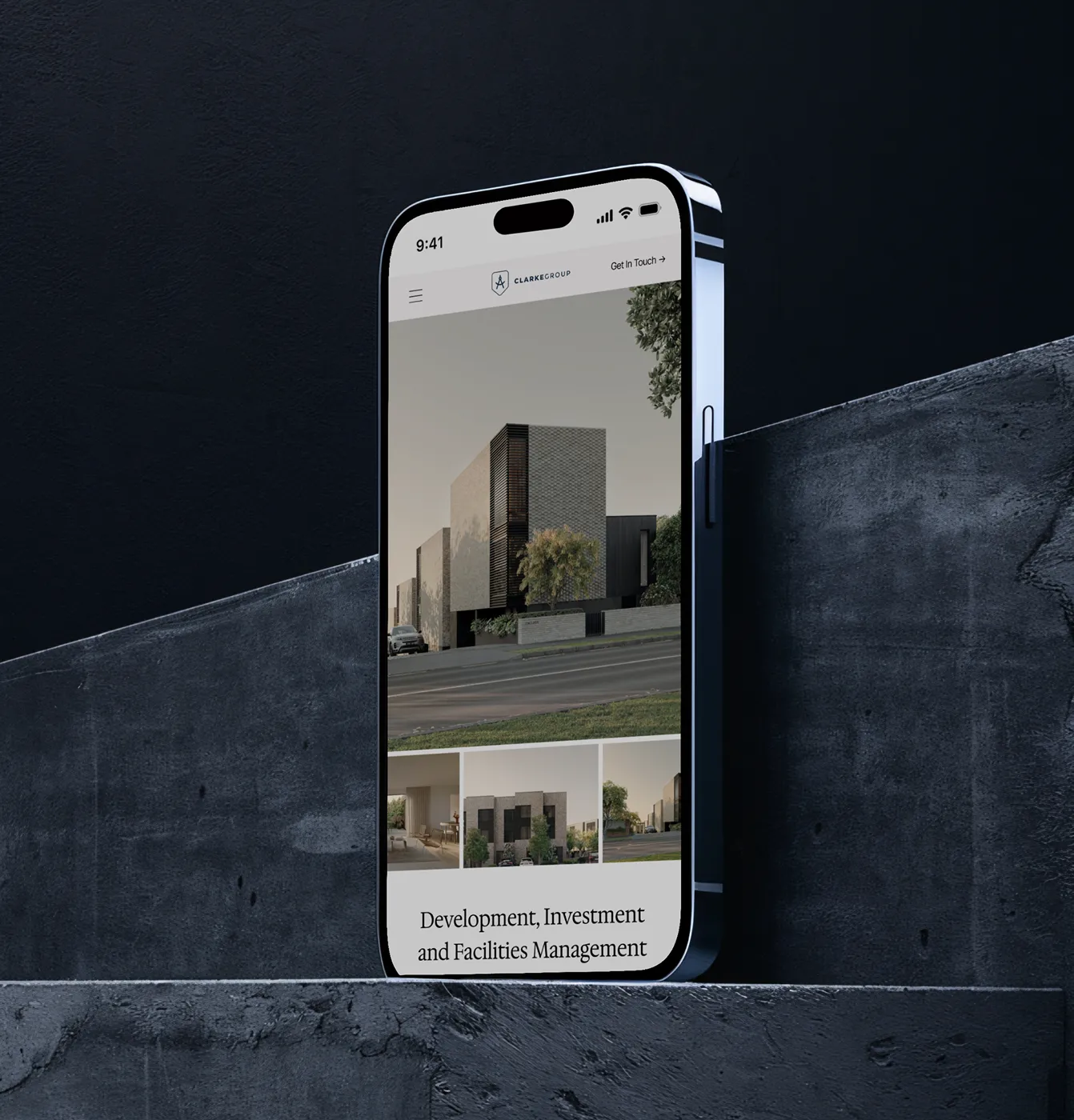
A homepage built to establish trust at first glance
The homepage opens with full-bleed architectural photography and a single, confident statement of what Clarke Group does: develop, invest in, and manage residential property at scale.
Rather than overwhelming visitors with options, the hero sets an editorial tone and guides them gently into the portfolio, with a persistent navigation that keeps properties, regions, and contact always within reach across desktop and mobile.
.webp)
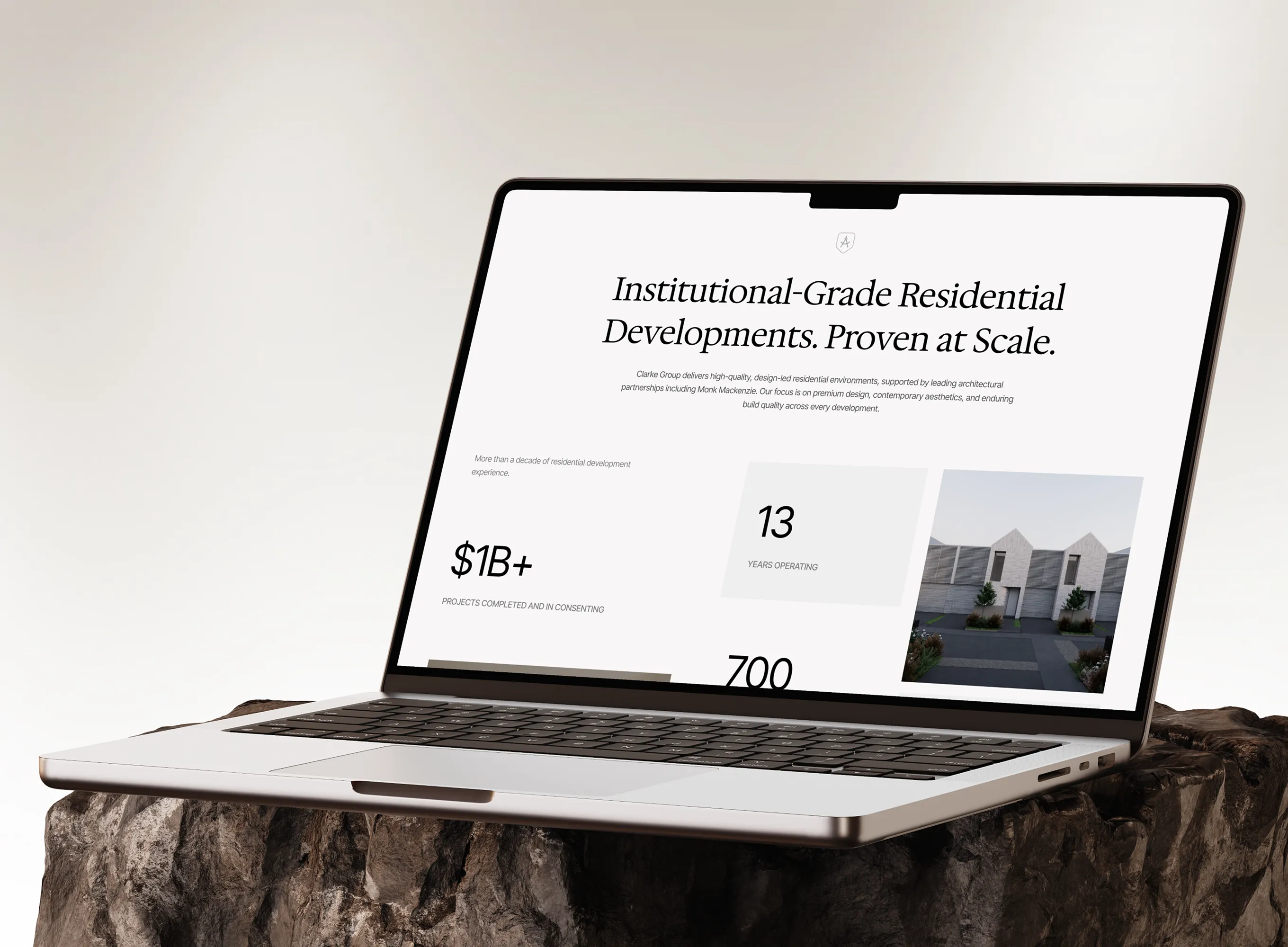
A decade of delivery, proven in numbers
Directly beneath the hero, a proof section translates Clarke Group's track record into hard numbers: projects delivered, tenancies created, and value developed, presented with generous spacing and a calm type hierarchy.
The intent was to establish institutional credibility quickly, so investors and partners can gauge the scale and reliability of the business at a glance, without wading through dense copy or marketing language.
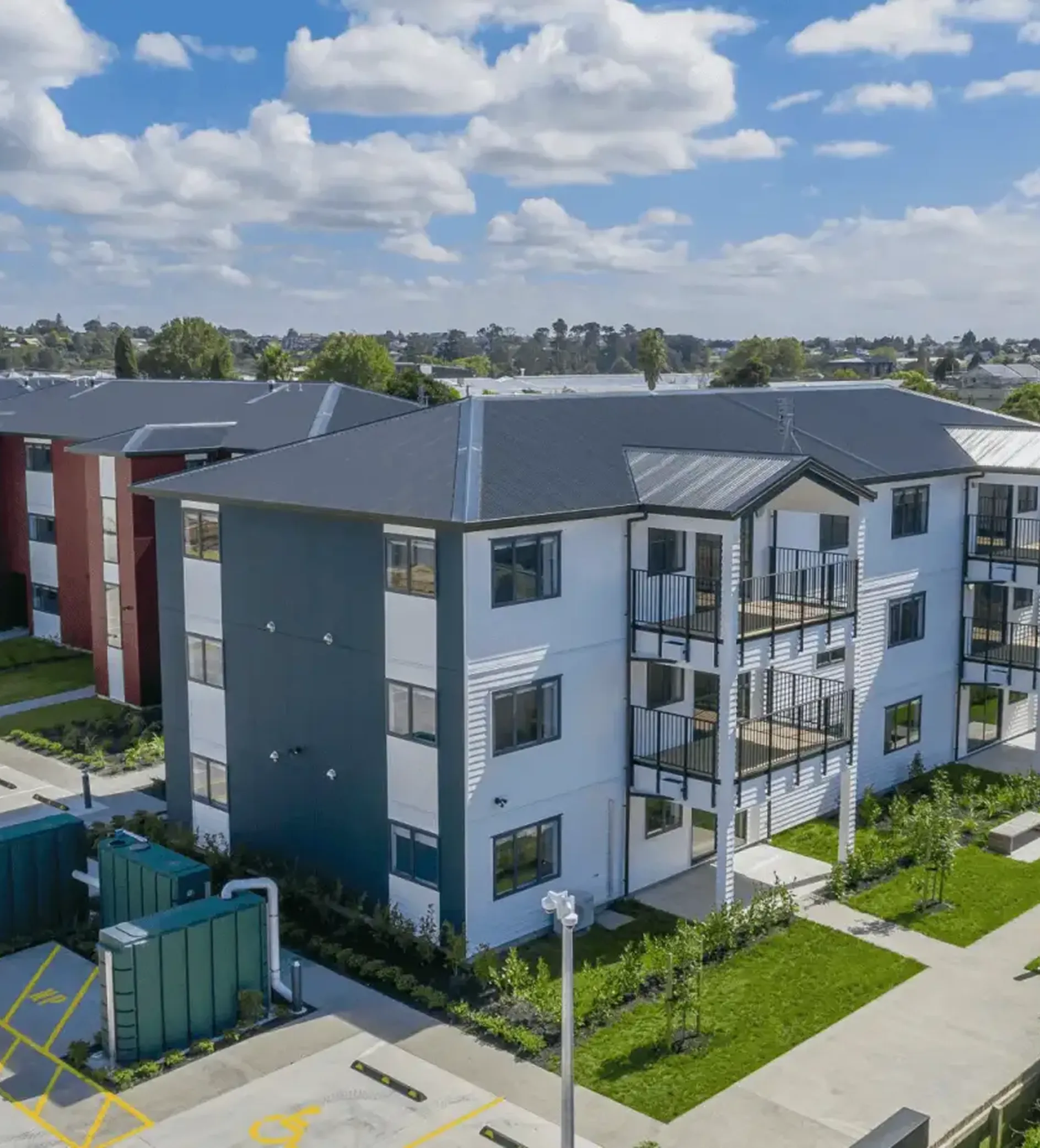
Helping buyers browse, compare and enquire with ease
The listings experience lets buyers explore available homes by development and location, with clean property cards that lead into detailed pages. Each listing is paired with a low-friction enquiry form that captures intent the moment interest peaks and qualifies leads with a few considered questions.
The flow was designed to feel effortless: discover a development, understand it, and reach out, all within a couple of steps.
.webp)
.webp)
.webp)
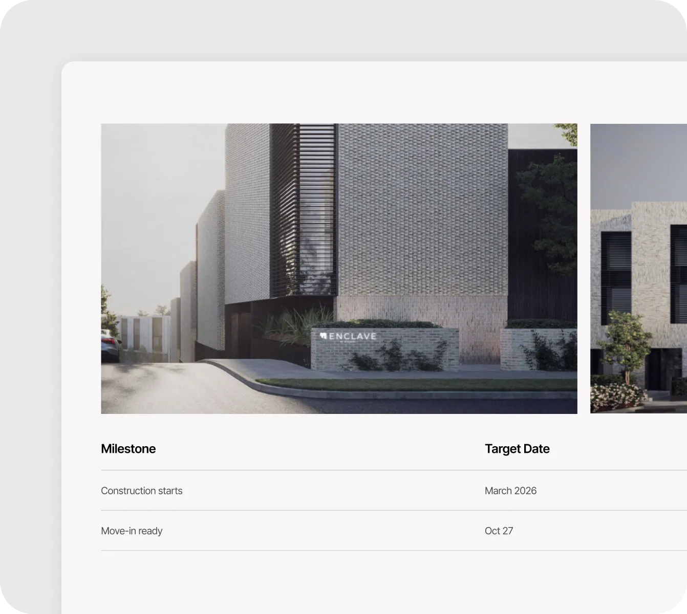
Making the investment case clear and transparent
For investor-facing developments, the detail pages go further, laying out net returns, lease structures, and government-backed assurances alongside a transparent construction timeline.
Milestones from resource consent through to completion are presented as a clear schedule, so prospective buyers can see exactly where a project stands. The page is built to answer the questions a serious investor asks, before they have to ask them.
.webp)
.webp)
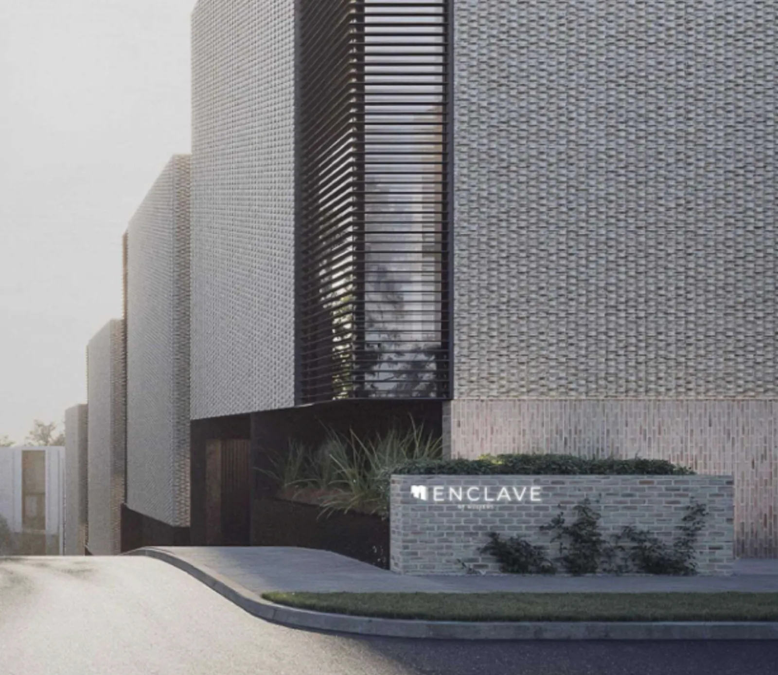
One modular template for every development
Every development has its own dedicated page, combining architectural imagery, location context, and key specifications in a consistent, easy-to-scan layout.
Whether a buyer is viewing an affordable home in Browns Bay or a premium townhouse, the structure stays the same and only the content changes, making the modular system effortless to extend as Clarke Group's portfolio grows across Auckland and Queenstown.
%201%20(1).webp)
Telling the Clarke Group story with restraint
The About experience carries the brand's narrative: over a decade of consistent delivery, a clear mission, vision and values, and a growth timeline charting the company's evolution. Earthy architectural tones and a structured type hierarchy reinforce the reliability buyers and investors look for.
.webp)
.avif)
.webp)
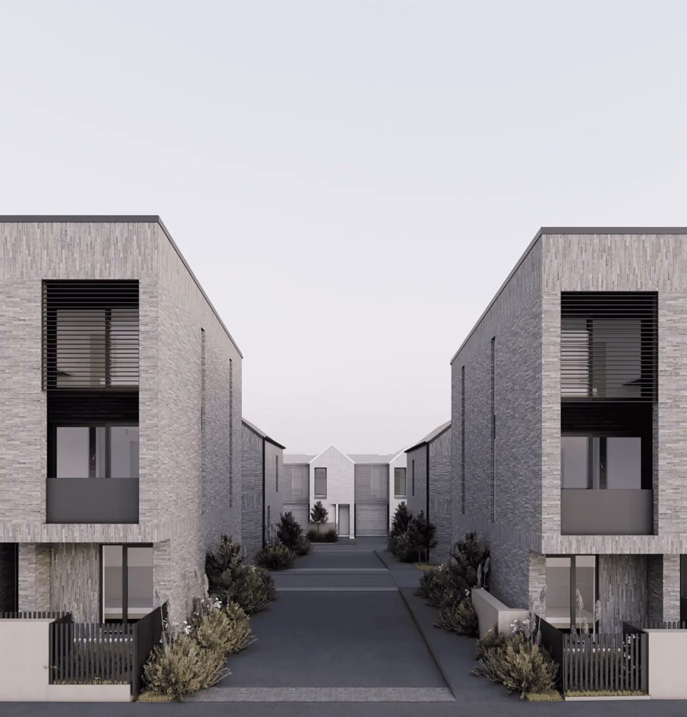
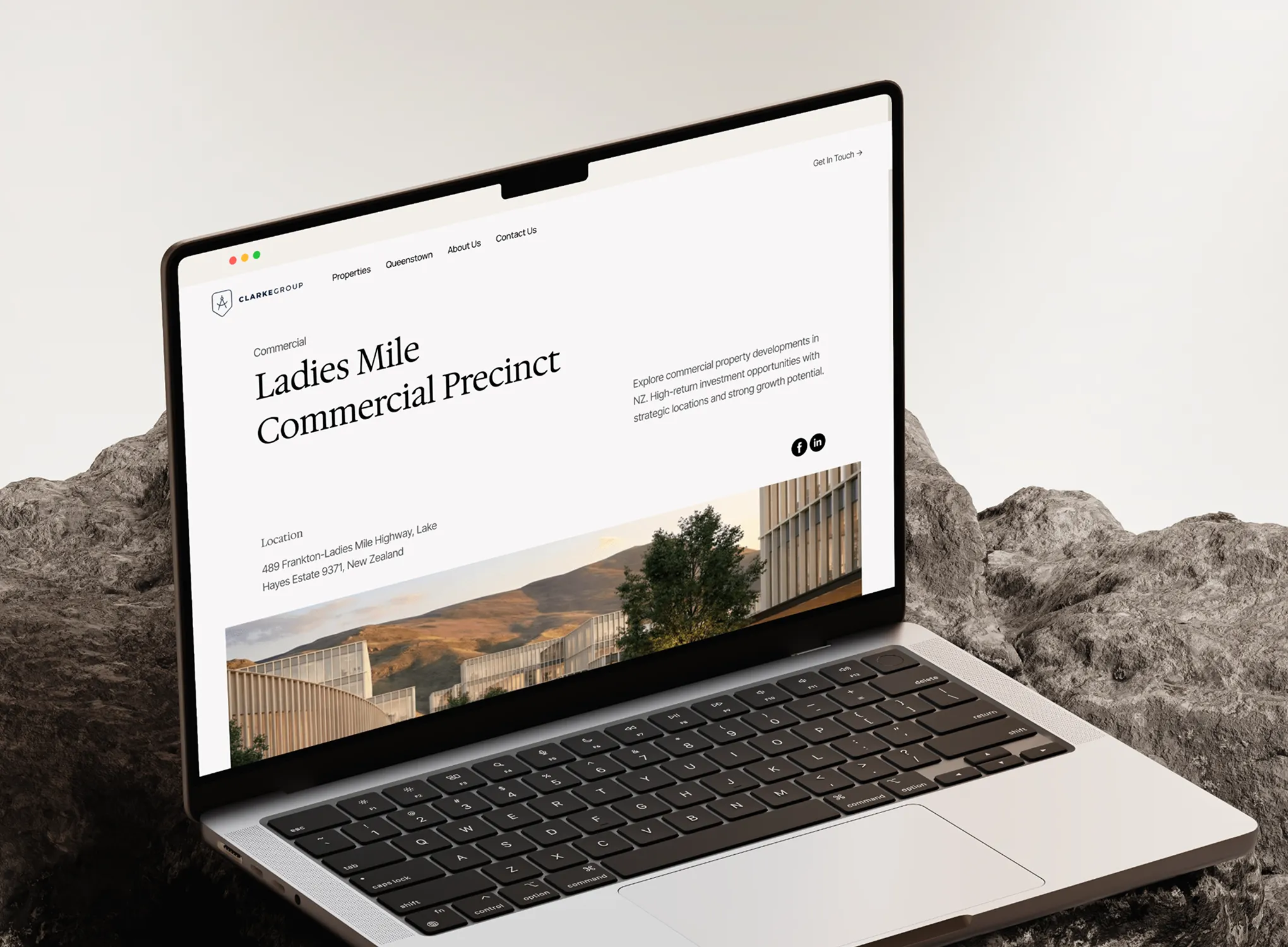
Framing the vision behind masterplan precincts
Larger ventures, like the flagship Ladies Mile precinct in Queenstown, needed a page type of their own. These masterplan pages frame the bigger picture: mixed-use vision, scale, and long-term community value, supported by wide cinematic imagery and concise, high-level messaging aimed at capital partners and institutional investors rather than individual buyers. The layout signals ambition while staying grounded and credible.
A simple, reassuring way to get in touch
The contact experience closes the journey with a warm, low-friction invitation to connect. A single, well-structured form routes general, sales, and media enquiries to the right place, while clear office, phone, and email details reassure visitors that there's a real, accessible team behind the brand. The goal was simple: make reaching out feel as considered and effortless as the rest of the site.
.webp)
A Complete Web Experience Designed to Build Trust and Drive Action
Every page guides the visitor with purpose, from first impression and portfolio discovery to detailed project pages and a clear path to enquiry. It doesn't just inform; it reassures and builds credibility, presenting Clarke Group as a trusted, design-led developer.
.webp)
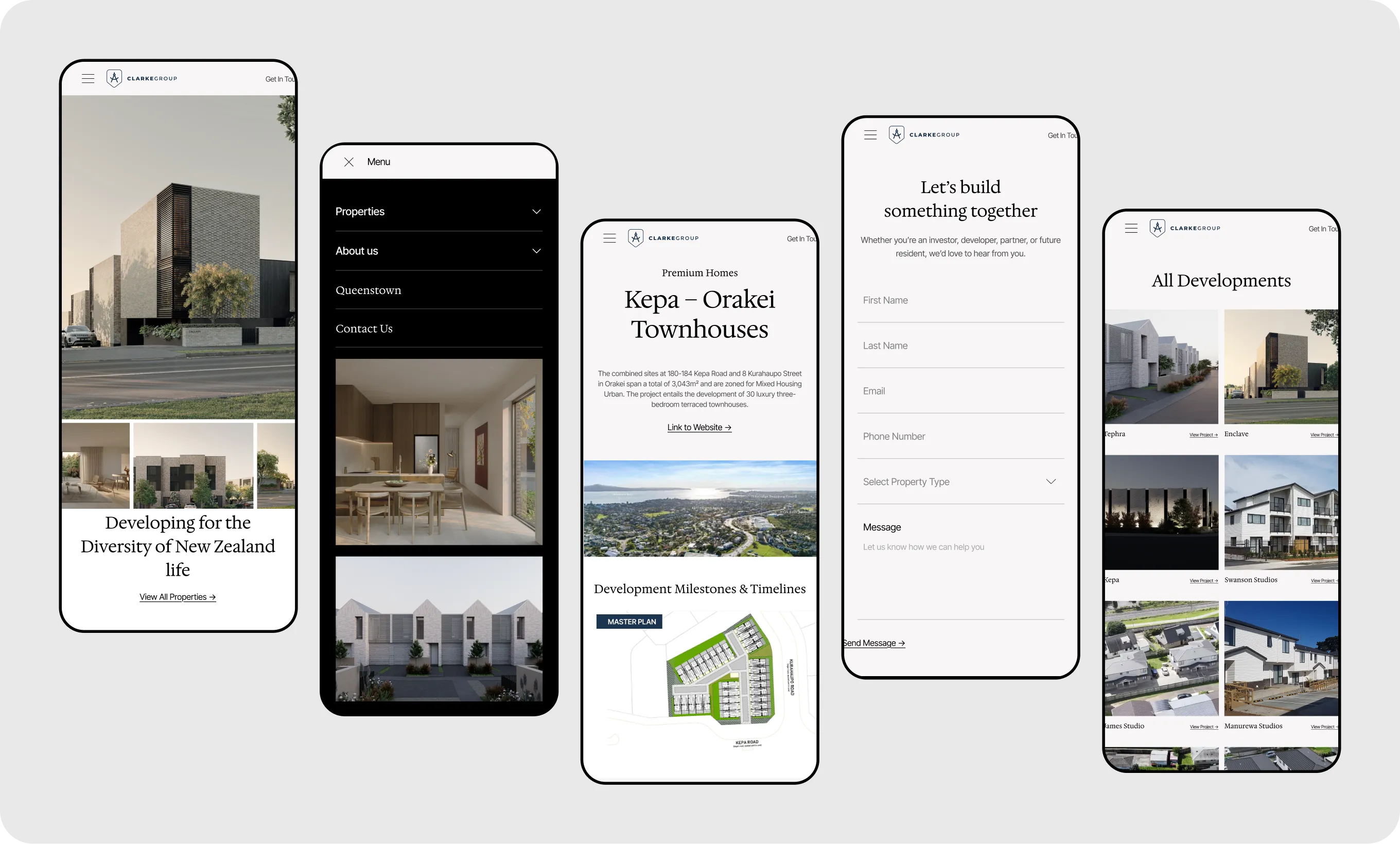
Designed to Perform on Every Screen
The experience was designed mobile-first, so the brand feels just as considered in the hand as on desktop. Navigation, imagery, project detail, and enquiry flows adapt gracefully to smaller screens, preserving hierarchy and readability, clear, fast, and on-brand throughout.
.svg)
.svg)
.svg)
.svg)
.svg)
.webp)
